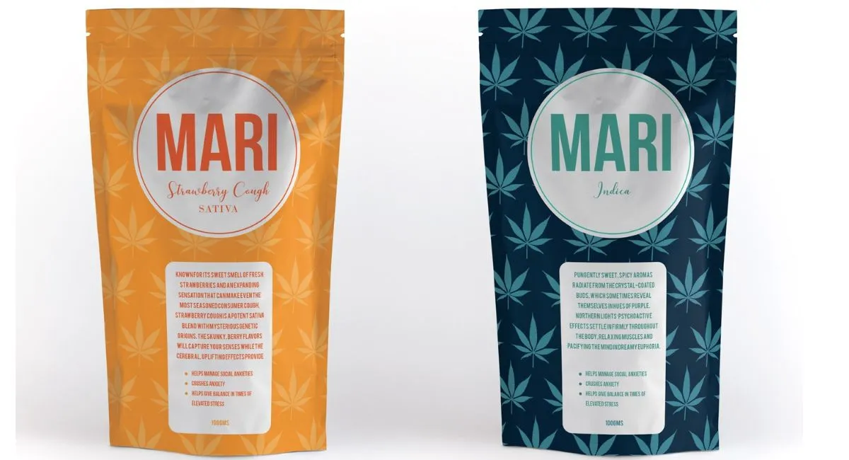
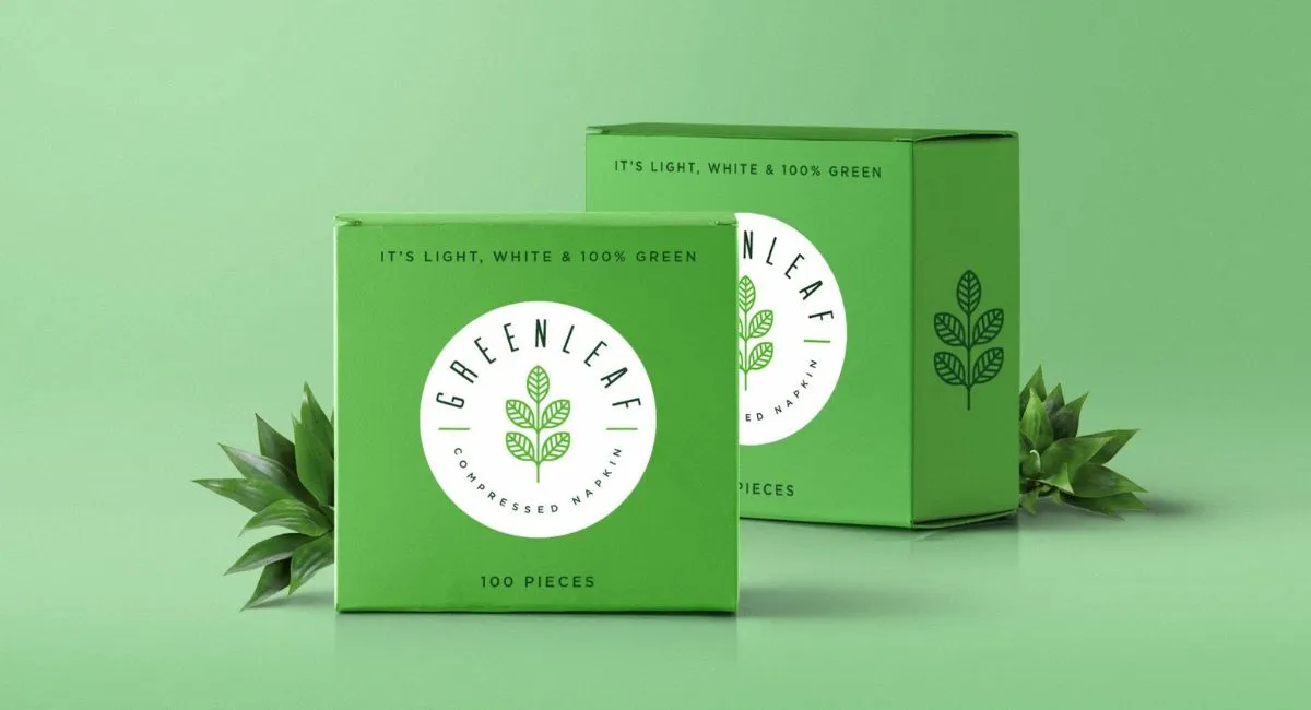
Shipping Boxes
RGB vs CMYK: What’s The Difference?
In the colourful world of packaging design, two prominent colour models reign supreme: RGB and CMYK. But what exactly sets them apart, and why does it matter for packaging? Let’s embark on a journey into the realm of colour to unravel the mysteries behind RGB and CMYK and explore their significance in the packaging industry.
Understanding RGB
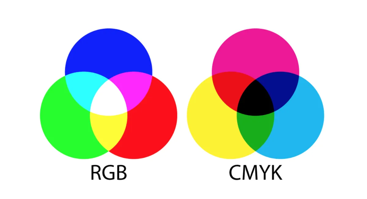
RGB stands for Red, Green, and Blue, the primary colours used in this colour model. Widely employed in digital displays such as computer monitors, television screens, and mobile devices, RGB is the go-to choice for anything that emits light.
The RGB colour model operates on the principle of additive colour mixing. This means that when different amounts of red, green, and blue light are combined, they create various colours. For instance, mixing red and green light produces yellow, while mixing red and blue creates magenta and green and blue produce cyan.
So, why does RGB matter in packaging? While the packaging may not emit light like screens, RGB plays a crucial role in the digital design phase. Designers use RGB to create vibrant, eye-catching visuals that accurately represent their brand and products on digital platforms like e-commerce websites and social media channels.
However, there’s a catch when transitioning from digital designs to physical packaging…
Deciphering CMYK
Enter CMYK: Cyan, Magenta, Yellow, and Key (Black). Unlike RGB, which relies on light emission, CMYK is a subtractive colour model primarily used in print media, including packaging.
The CMYK colour model operates on the principle of subtractive colour mixing. Here’s the gist: when pigments are applied to a surface, they absorb specific wavelengths of light, subtracting them from the mix and creating particular colours. For instance, combining cyan, magenta, and yellow inks produces a subtractive colour mixture that produces a wide array of colours, including reds, blues, and greens.
So, why the need for CMYK in packaging design? While RGB dazzles on screens, CMYK takes the stage regarding printing. Whether corrugated cardboard, paperboard, or labels, CMYK is the go-to choice for accurately reproducing digital designs on physical packaging materials.
The RGB to CMYK Conversion Conundrum
Ah, here lies the challenge: the RGB to CMYK conversion process. What you see on your vibrant computer screen might not translate precisely when printed on packaging materials. Why? Because the colour gamut—the range of colours that can be accurately represented—differs between RGB and CMYK.
RGB boasts a broader colour gamut than CMYK, meaning it can display colours that are outside the printable range of CMYK. As a result, specific vibrant RGB colours may appear duller or slightly different when converted to CMYK for print. This phenomenon is often referred to as colour shifting.
Packaging designers must tread carefully when transitioning from RGB to CMYK to ensure their designs maintain their intended vibrancy and accuracy. This involves careful colour management, proofing, and adjustments to compensate for discrepancies between the two models.
The Importance of Color Consistency in Packaging
In the world of packaging, consistency is critical. Whether your product sits on a shelf or pops up on a screen, maintaining colour consistency across all touchpoints is paramount for brand recognition and consumer trust.
Imagine this: you’re strolling down the aisles of a supermarket, scanning the shelves for your favourite snack. Suddenly, you spot a brightly coloured package that catches your eye. But wait, is it the same vibrant hue you remember seeing online? Or has the colour been lost in translation during the printing process?
Colour consistency ensures that what consumers see online aligns seamlessly with what they encounter in-store. It fosters brand recognition, instils confidence in your product, and enhances the overall consumer experience. Packaging designers can uphold this essential aspect of branding by mastering the art of colour management and understanding the nuances between RGB and CMYK.
The Future of Color in Packaging
As technology continues to evolve, so does the landscape of colour in packaging. With advancements in digital printing techniques and colour management tools, the divide between RGB and CMYK is gradually narrowing.
Furthermore, emerging trends such as augmented reality (AR) packaging push the boundaries of colour representation in packaging design. AR technology allows consumers to interact with packaging digitally, blurring the lines between the physical and virtual worlds. In this dynamic environment, colour becomes even more pivotal in capturing consumer attention and driving engagement.
In conclusion, while RGB and CMYK may represent different facets of the colour spectrum, they are both integral to the art and science of packaging design. Understanding their differences, mastering the conversion process, and prioritizing colour consistency are essential steps in creating packaging that captivates consumers and elevates brands to new heights in the vibrant world of retail.